Just as in English advertising you’ll see some letters substituted with images, the same happens in Chinese, and you’ll often see parts of characters replaced. I’ve captured a few examples below, but let me know if you spot any yourself!
In what we’ll call questionable taste. A kid with an open mouth takes the place of the 「口」 component of 「吃」 in this sign (and yes, 吃 has most if not all of the connotations of the word “eat” in English). It reads 「吃我 早午餐」 (Eat Me – Brunch).
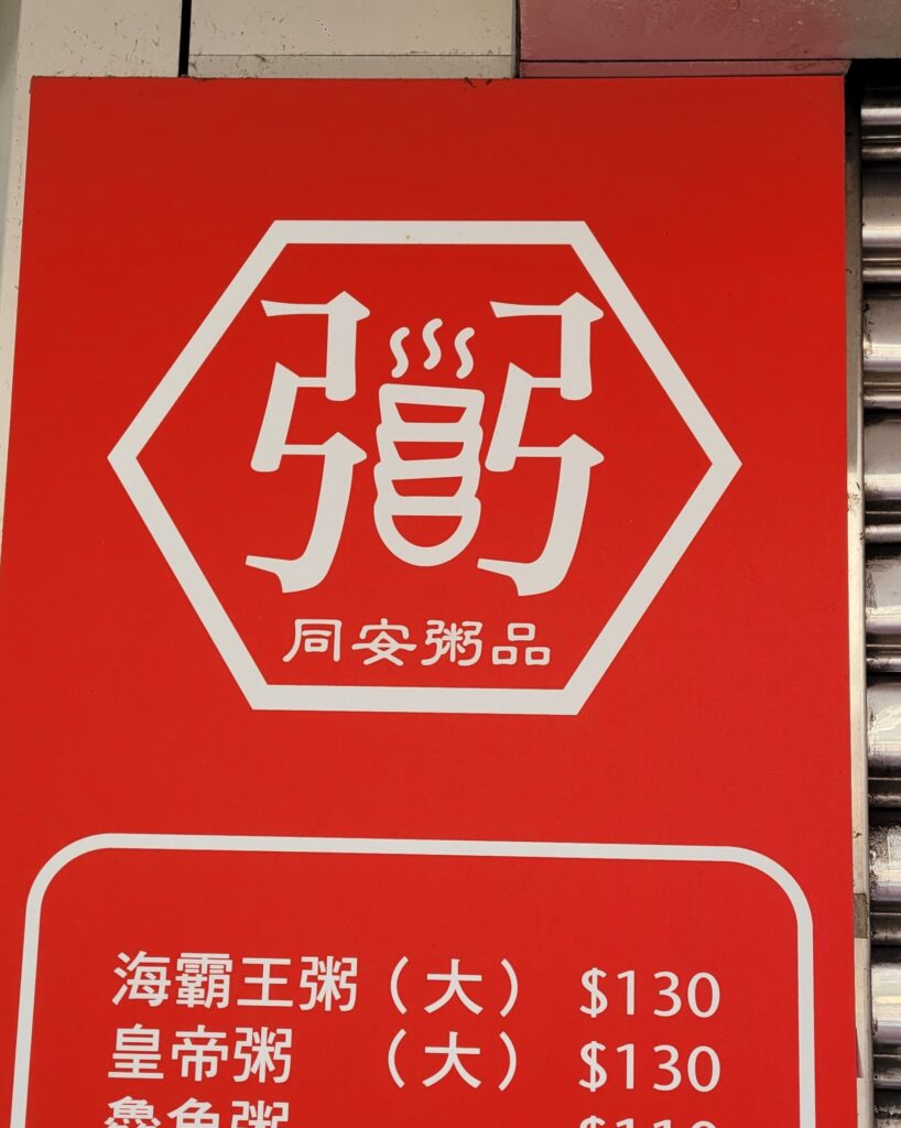
This congee shop has creatively substituted the central 「米」 component of 「粥」 for a stack of steaming bowls of congee.
I’m always interested to see how variants of standard Chinese characters are still used in everyday life, whether it’s handwriting, signs or an author making a stylistic choice.
I spotted this beauty at a petrol station in Taitung. You can understand the reason for the simplification of the top of the character given the chunky font required by this kind of paint:
This character is 「嚴」(yán/strictly), but the top has been simplified along the same lines as the simplified version of the character 「严」. It retains the 「敢」 of the traditional character though:
Another joke today from ‘A Boy Name Flora A‘ this one of the blue variety (or yellow as they say in Chinese).
The translator has tried to compensate for not being able to translate the joke fully by creating a different joke in English with the same material. It’s quite artfully done although the joke doesn’t make as much sense with reference to the character and is a tad less graphic.
First the kid is reading the words written on the van “Donated by Rui An Temple Commisioner Zheng Shuang” out loud to the older guy, but he mistakenly reads 「爽」(Shuang) as 「夾」 (jiā), as part of the name Zheng Shuang. When not used in names “夾” (jiā) means “to pinch” and “爽” (shuǎng) means joy or pleasure, generally with a heavy sexual connotation.
The older guy then replies “夾你的屁股啦” / “‘Pinch’, my arse!”, which is also funny, because it can be read as “Pinch my arse!”. He then points out the differences between the character 「夾」 (jiā) and the character “爽” (shuǎng), by describing 「夾」 (jiā) as a person radical (大) with two 叉 (乂) parts, even though the actual form is 「人」. Then he describes the character “爽” (shuǎng) as a person radical (大) with four 叉 (乂) parts. As 「叉」(chā) which represents this shape 「乂」 in the character is a homonym for 「插」(chā) meaning to insert in Mandarin, the sentence can be interpreted another way: “If you insert (插) four (implication is penises) in one person, that’s real pleasure (「爽」shuǎng). Although the last 「爽」(shuǎng) he pronounces using its Taiwanese pronunciation sóng.
The translator has tried to compensate in the English with a joke about exes:
-“Donated by Chairman of Rui An Temple Jia Zheng” -That’s not “Jia,” dumbass. It’s “Shuang.” -It looks like a man in the middle with four “Xs.” This character is called “Shuang.” One man with four exes. That’d be fun.
I think that this is a decent attempt to try and conserve the humor of the situation, as it can be read as sarcasm, but the English audience don’t know the relation between fun and shuang unfortunately.
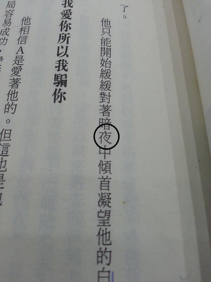
I found this version of 夜 in Roan Ching-yue’s 《哭泣哭泣城》 The Sobbing City, from which I translated ‘The Pretty Boy from Hanoi’ in a previous post:
Does anyone know what font this is? All the fonts I have on my computer have both their legs – I like the elegance of this form of 夜 though. Anybody familiar with it? Comment below.
By the way, I’m planning a few more translations from this collection of short stories, so look out for them over the coming months.
For Chinese font watchers, I recently came across this book in a Taipei book store.
I had a little flick through – though budget constraints prevented me from buying it yet. From what I saw it explains variations in the use of font in shop, road and MRT signs, looks to be an interesting read.
Dafont has some additional Chinese fonts for those interested.
Someone recommended Shi Zhecun (施蟄存) a writer and translator from the 新感覺派 or New Sensationalist Movement in Shanghai in the thirties and forties. I remember looking at some of these writers in a class on Modernism with Lee Ou-fan (李歐梵), and they’re quite cool for the time. While reading I came across a character as shown in blue below:
I’ve noticed certain interesting irregularities in Chinese fonts. The book I’m reading at the minute (《馬橋詞典》; the edition was originally published by 聯經出版社/Linking Books) in Feb. 2011, and this copy is the second printing) uses the form of the character 感 seen in the top line of the image below, as opposed to the one on the bottom. The character on the top line has a 丿that encloses the entire character, as opposed to the one on the bottom line in which the heart radical at the bottom is separate. I’ve noticed similar differences in other characters before and was curious if anyone else had spotted any other slight differences that come to mind. Also curious if this is influenced by historic instances of difference in the way the character can be written.
The interesting thing for me as a Cangjie user is that it should technically change the way the character is written in Cangjie, as instead of 戈口心 it should follow the example of 威 (戈丿一女) and be written 戈丿一心, although obviously this is just a font.
Which form do you come across the most in the books you are reading? What are the names of the different fonts that use this form?