Just as in English advertising you’ll see some letters substituted with images, the same happens in Chinese, and you’ll often see parts of characters replaced. I’ve captured a few examples below, but let me know if you spot any yourself!
In what we’ll call questionable taste. A kid with an open mouth takes the place of the 「口」 component of 「吃」 in this sign (and yes, 吃 has most if not all of the connotations of the word “eat” in English). It reads 「吃我 早午餐」 (Eat Me – Brunch).
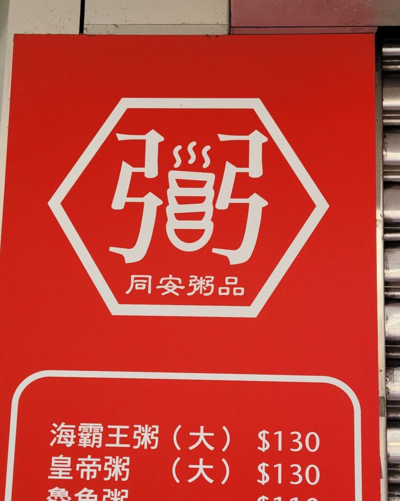
This congee shop has creatively substituted the central 「米」 component of 「粥」 for a stack of steaming bowls of congee.
One of the cooler examples I’ve seen (although still clearly an abomination), is the one below, where the English characters “NO” (here short for “Number”) are substituted in the place of the 「氵」 as part of the fraud-proof/banking version of the character for seven 「柒」. (Notice also that, as if to make up for the complication of the first character, the simplified version of 「號」 is used):
You can also spot random circles in the characters at the neighbouring store in the picture.
Here, things are a little more subtle, with the 「田」 component of 「福」 replaced by what looks like a lotus flower.
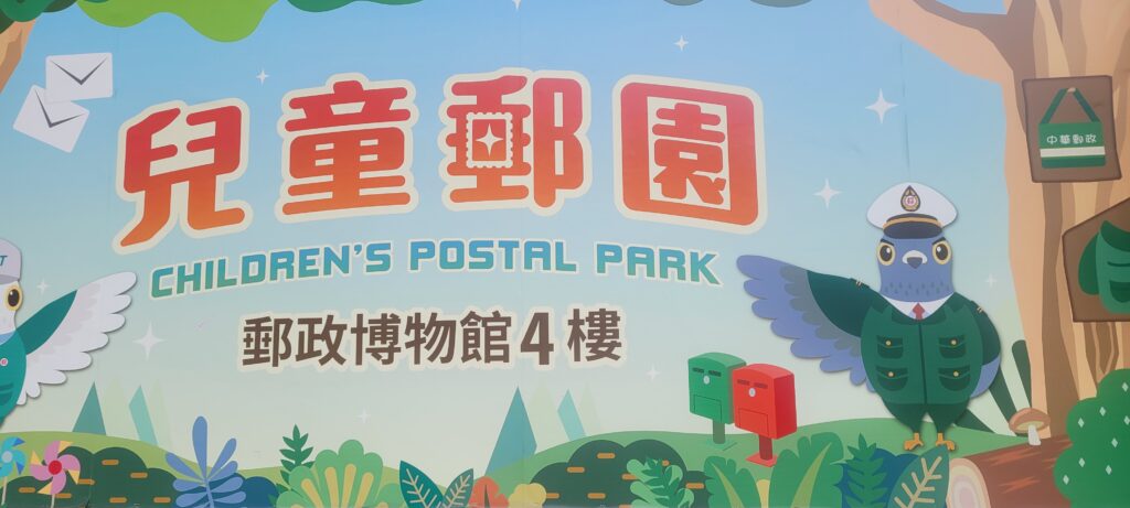
The Post Office strikes again with this stamp placed on 「郵」as below:
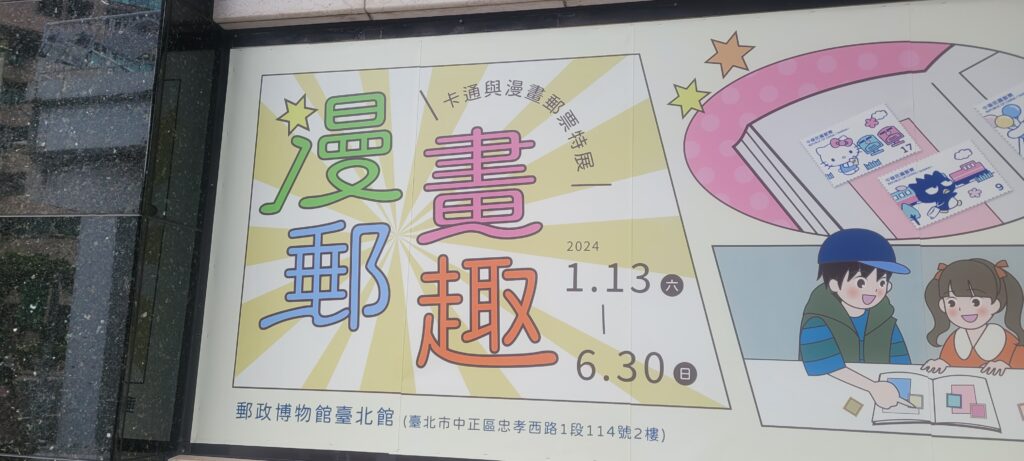
The serial offender, also had this rather subtle example, where the top of 「氵」 in 「漫」 is substituted for a star:
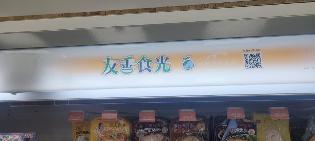
This example is a little more subtle, with two leaves replacing the top two strokes on 「善」, as well as a slight distortion to the bottom 「口」 component.
UPDATE March 26, 2024—
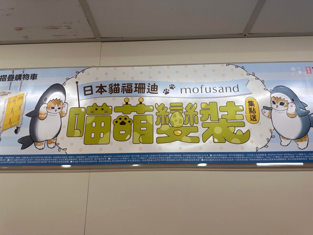
7-11 has teamed up with the Mofusand illustrator (creates cats that like to dress up as sharks, toast, reindeer and rabbits etc. You know, normal things like that) on a points collection campaign to win a folding shopping crate.
In this example, the various components of the characters have cat and dinosaur features to them: 「喵萌變裝」。
The 「艹」 of 「喵」 becomes a cat’s head.
While the 「艹」 of 「萌」 incorporates some sort of gaming machine controllers and the
「日」 is a cat’s paw.
The 「口」in the middle of 「變」 is what looks like a dinosaur egg.
One of the strokes of 「衣」 in 「裝」 incorporates a dinosaur (or crocodile) tail.
Please feel free to email any abominations you find on the streets of Taiwan or elsewhere!
The majority of shop signs I saw in my brief wanderings, however, do not employ this technique, preferring either to use specific fonts. I’m not sure whether this is a question of aesthetics or simply that it costs more to design custom characters. What do you think?