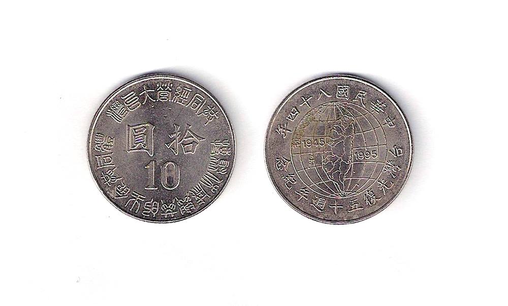
Geeking out again after discovering another commemorative coin. The front reads 「共同經營大台灣」 (Running Greater Taiwan together) and below that “搏聚休戚與共的生命共同體” (United together through thick and thin as a community of fate). It’s written in seal script, which explains why it’s quite hard to read. I thought 「共」 looked particularly unlike it’s seal script version:
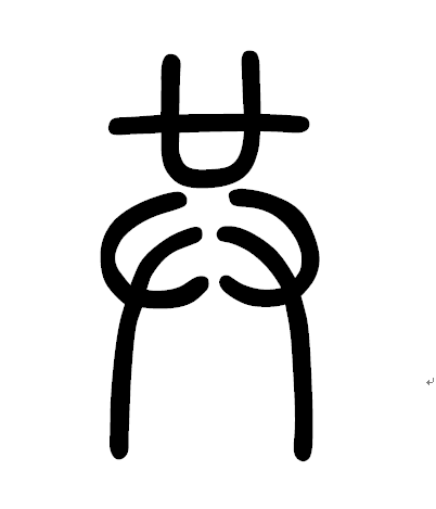 」
」
However, you can see the pattern when you compare it with 與, as the bottom of both characters is the same. You can download the seal script font for programs on your computer, including Word, here, although unfortunately you have to type in simplified for it to work (after unzipping drag the TTF file into your Control Panel\All Control Panel Items\Fonts folder).
This coin was issued in 1995 to commemorate the 50th anniversary of Taiwan being ceded to the Republic of China by Japan after World War II. This is commonly referred to as 「光復」(guang1fu4) in Chinese, which literally means “to restore the light”.
This term has sparked a certain amount of controversy given its implication that those living in Taiwan under Japanese rule were living in “darkness” until Chiang Kai-shek came to bring them to the light. The government of Taiwan launched a series of campaigns to attempt to “re-sinicize” and the populace of Taiwan, which the Republic of China government felt had been brain-washed or “enslaved” (奴化) by the Japanese in during the 50 years of colonial rule. The local population had been introduced to modernity under Japanese rule, but many artists and writers faced persecution or marginalization under the new Kuomintang government, as they were seen as collaborators by the new regime or never properly got to grips with writing in Chinese. Those who had been formally educated in the Japanese language had to learn Mandarin and this led to much of their work being overlooked until more recently, when it was translated from Japanese.
There is an excellent book on this period by historian Huang Ying-che (黃英哲) called Uprooting Japan; Implanting China: Cultural Reconstruction in Post-War Taiwan 1945-1947 (《「去日本化」「再中國化」戰後台灣文化重建(1945-1947)》): Continue reading →